Branding - Visual identity
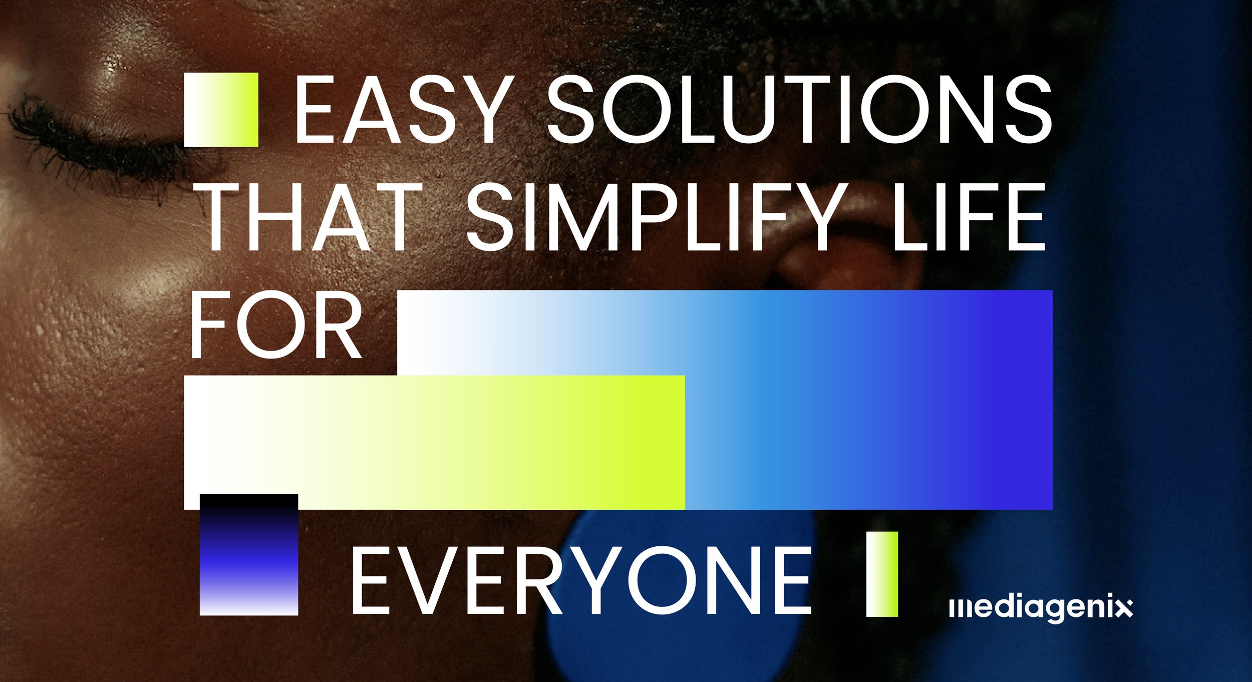
The global software company that ensures the smooth processing of media content across all continents is ready for the future. Mediagenix turned to Fightclub for a complete rebranding. In today’s world, we are flooded with digital imagery—constantly shifting, not always perfect. Sometimes, we notice distortions or 'glitches,' brief moments that remind us of the technology working behind the scenes. This idea of imperfection became the foundation of the new visual style: the glitch symbolizes the hidden world 'behind the screen,' where the product comes to life.

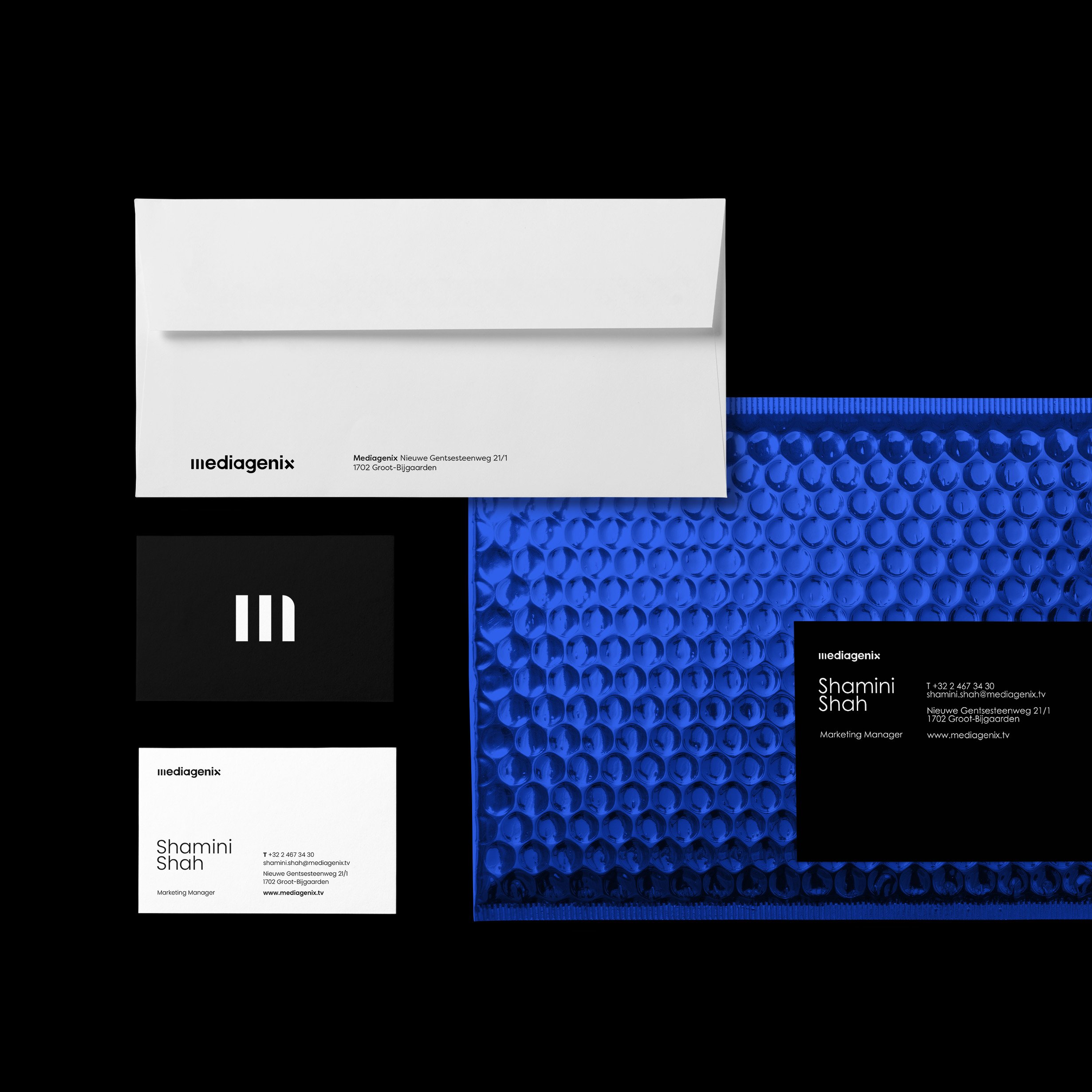
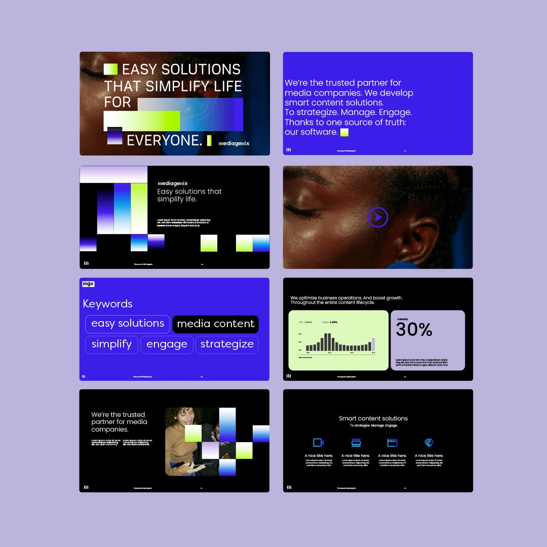
The vibrant primary colors reflect the energy and dynamism of the digital landscape, while the softer, secondary hues represent the human touch. In addition to a new logo, where the 'M' is built from three pillars representing the core activities—'strategize, manage, and engage'—the tone of voice and photography were also defined. The layouts are modular, allowing the visual style to evolve and adapt to future needs.
A project for Fightclub.be: Art & Design: Mona-Lisa Venlet // Creative Director: Stijn Pauwels // Motion Design: Elien De Geetere & Samuel Allemand