Branding - Visual identity - Art Direction - Digital Campaign
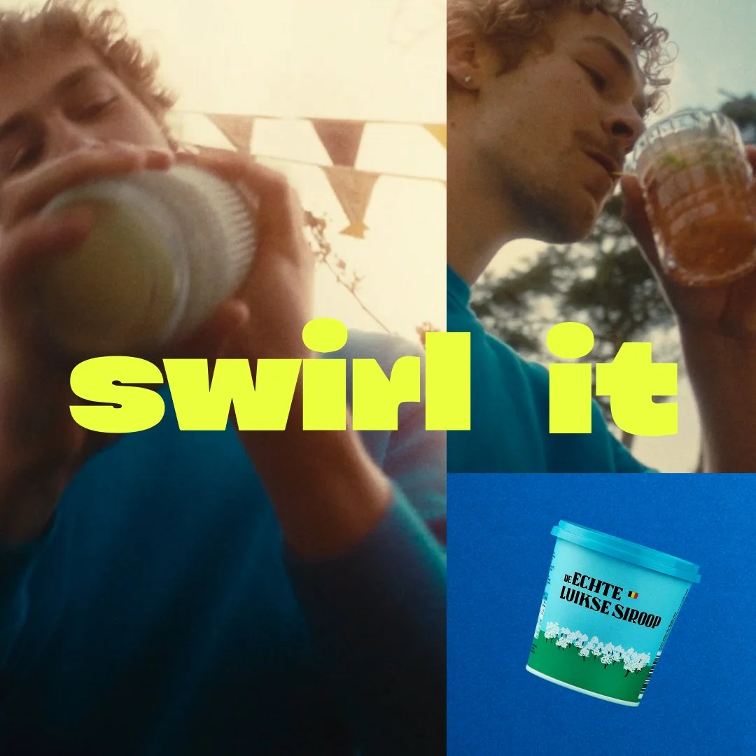
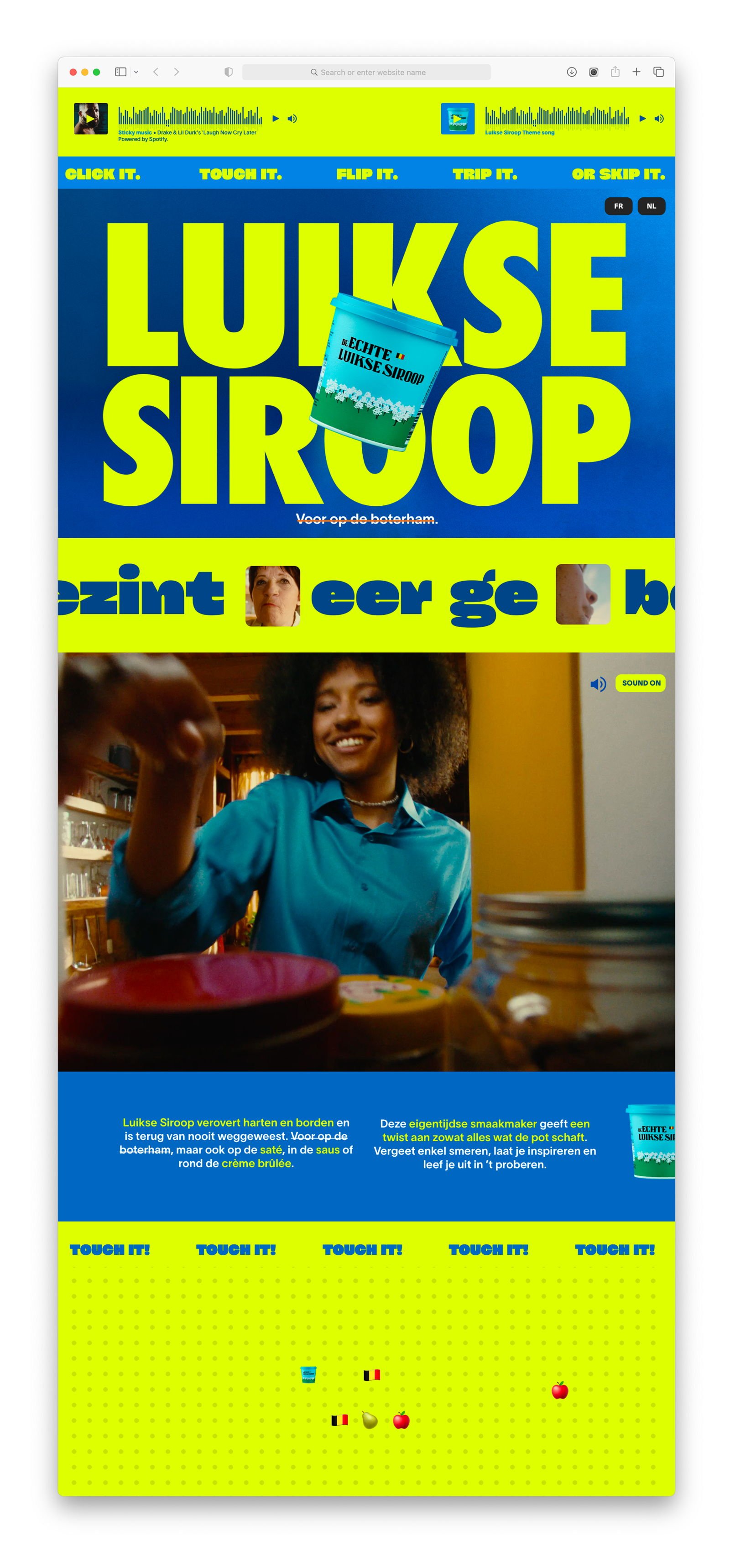
The design of the pot, which had remained unchanged for 79 years, has been given a fresh new look. The iconic essence of the pot is retained for recognizability, but the use of colors, fonts, and tagline, as well as the messaging, strategy, and website, have been modernized. This way, the pot remains recognizable on the shelves, yet comes across as surprising and fresh.

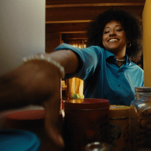
The relaunch kicks off with a digital awareness campaign, where the campaign video is audibly inspired by pop music. It was created in collaboration with De Machine and Poum Tchak. The tagline "for on the sandwich" is dropped, expanding the previously well-known usage occasions and shifting towards a campaign with culinary suggestions like ‘swirl it, lick it, heat it, flip it.’ Bright and bold, combined with a creative visual style. The social media campaign also adds a fresh layer of energy to the trusted brand.
A project for Fightclub.be: Creative concept & copy: Carmen van Buggenhout, Bart Gielen // Concept & Art: Mona-Lisa Venlet, Jeffrey Uten // Creative Director: Stijn Pauwels