Strategy - Packaging Design
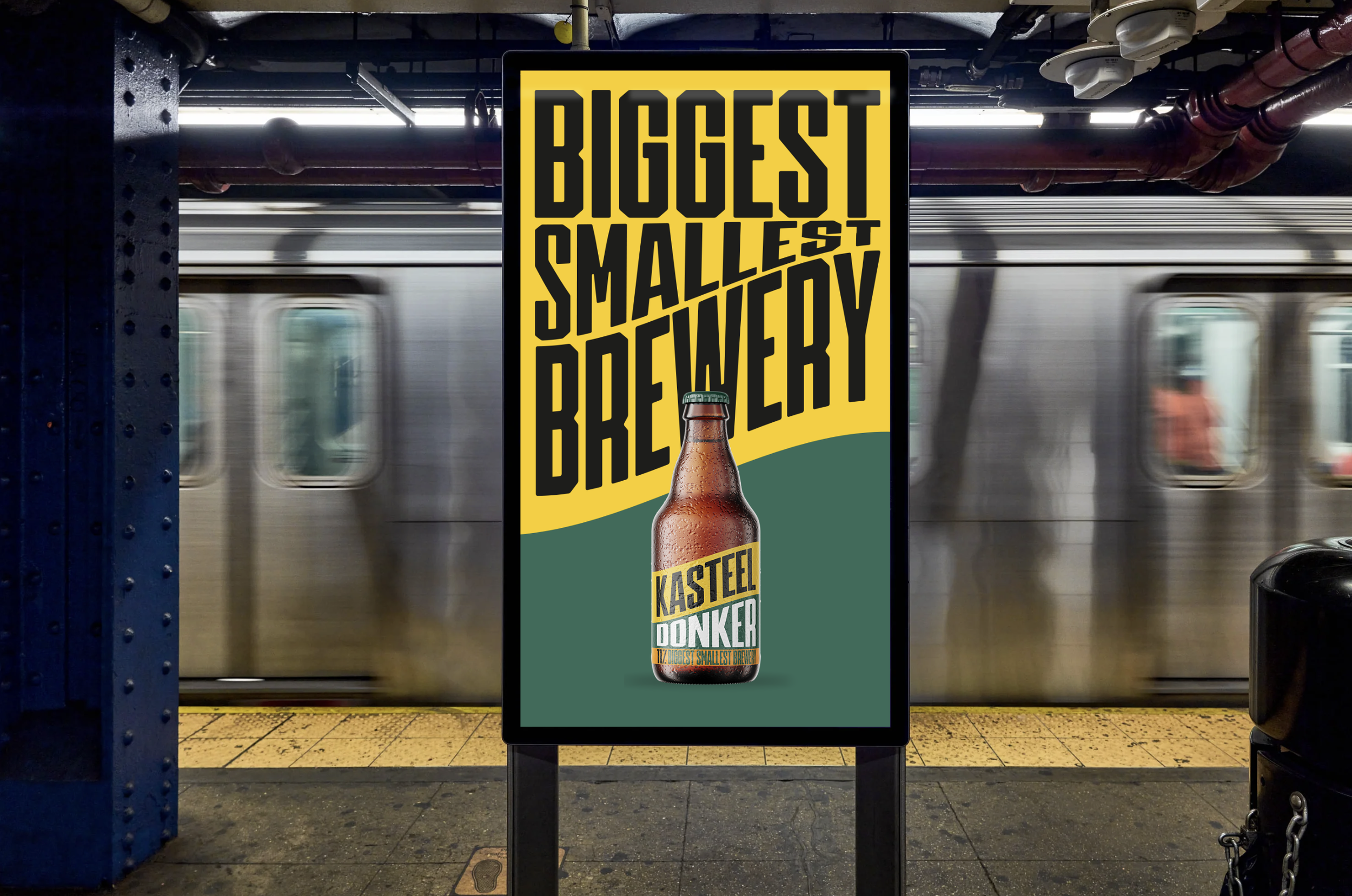
A test drive for Kasteelbier: new strategy and packaging design. Didn’t make the catch, but worth the exercise. At the heart of this transformation is a unique wordmark with distinctive, recognizable typography that immediately resonates and aligns with Kasteel’s identity. These new visual elements enhance the brand’s visibility and give it a contemporary appeal.

The essence of the castle pennant has been preserved across most elements. It remains the central focus of the packaging, with typography consistently refreshed. A major update comes from a vibrant new color palette, featuring shades that range from bright blue to grass green. Although Kasteel's rebranding reflects a trend that goes beyond simplicity, colorful and accessible cans are trending. As the line between beer beverages and cute milk brands becomes increasingly blurred, Kasteel's 'brighter' direction makes sense for a brand that targets evolving tastes.
A project for Fightclub.be: Strategy: Bart Gielen // Concept & Art: Mona-Lisa Venlet // Creative Director: Stijn Pauwels